XDS Open SourceBuild with AIAn open design system for building internal tools with AI-powered development. Ship faster with 172 accessible, themeable components.
Libraries & Packages
Install what you need. All packages are published under the @xds scope.@xds/cliv0.0.13Scaffold projects, browse templates, generate themes, and get agent-ready docs from the command line.
@xds/corev0.0.13The component library. Accessible, themeable React components with built-in spacing, dark mode, and StyleX styling.
AaBody text<Code />
@xds/theme-dailyv0.0.13Daily theme for XDS — warm, productivity-focused palette with Lucide icon set
AaBody text<Code />
@xds/theme-defaultv0.0.13Clean neutrals with a blue accent. Pairs with Heroicons for a polished, professional look.
AaBody text<Code />
@xds/theme-matchav0.0.13Matcha theme for XDS — earthy green palette with Figtree typography and Lucide icons
AaBody text<Code />
@xds/theme-neutralv0.0.13Understated warm grays with a subtle palette. Pairs with Lucide icons for a minimal, quiet aesthetic.
Foundations
The design tokens and primitives that every component is built on.All TokensComplete reference for spacing, color, radius, typography, shadow, motion, and size tokens.
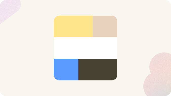
ColorSemantic color tokens for surfaces, text, icons, borders, and status indicators.
ElevationShadow tokens for visual elevation and inset state rings.
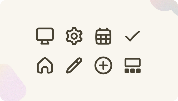
IconsSemantic icon names available in XDS. These adapt to the active theme's icon registry.
MotionDuration and easing tokens for animations and transitions.
ShapeBorder radius tokens for consistent component rounding — from sharp corners to full pills.
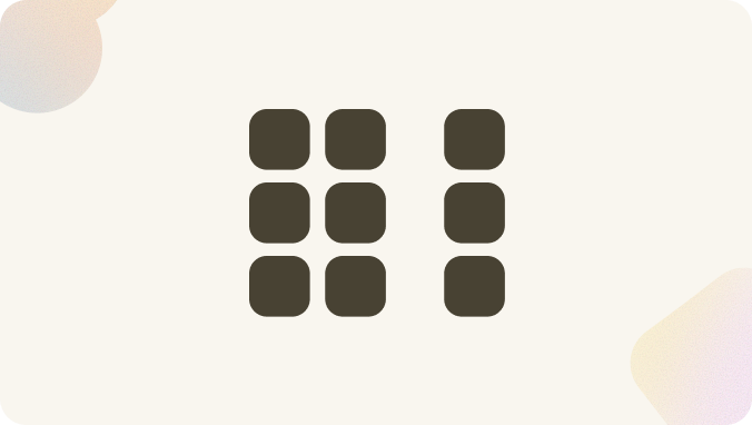
SpacingSpacing scale tokens for padding, gap, and margin — the rhythmic foundation of XDS layouts.
TypographyFont families, geometric type scale, weight, line-height, and semantic text tokens for consistent, accessible text styling.